http://www.kooga.com.au/retailcatalogue/
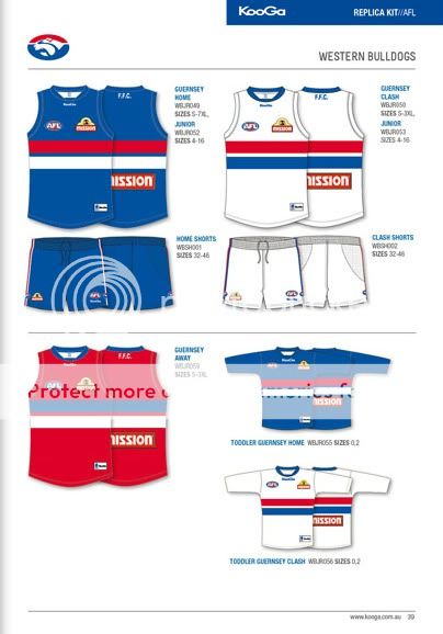
Be the looks of here we will have a blue home, white clash and red away guernsey.
 Thanks: 0
 Likes: 0
Results 1 to 15 of 63
Thread: Red Away Jumper.
-
08-11-2011, 08:57 AM #1
 Hall of Fame
- Join Date
- Nov 2008
- Location
- Kyabram
- Posts
- 13,890
- Post Thanks / Like

Red Away Jumper.
The curse is dead.
-
08-11-2011, 09:31 AM #2
WOOF Member
- Join Date
- Nov 2007
- Location
- NSW
- Posts
- 102
- Post Thanks / Like
Re: Red Away Jumper.
I would be a big fan of this if true. Matched with black or would be a good look IMO.
-
08-11-2011, 09:32 AM #3
WOOF Member
- Join Date
- Jan 2007
- Posts
- 7,664
- Post Thanks / Like
Re: Red Away Jumper.
 85, 92, 97, 98, 08, 09, 10... Break the curse!
-
08-11-2011, 10:14 AM #4
WOOF Clubhouse Leader
- Join Date
- Jan 2007
- Location
- Wherever the dogs are playing
- Posts
- 61,222
- Post Thanks / Like
Re: Red Away Jumper.
If this is true, once again the fans have not been communicated to?
FFC: Established 1883
Premierships: AFL 1954, 2016 VFA - 1898,99,1900, 1908, 1913, 1919-20, 1923-24, VFL: 2014, 2016 . Champions of Victoria 1924. AFLW - 2018.
-
08-11-2011, 10:14 AM #5
Bulldog Team of the Century
- Join Date
- Jul 2008
- Location
- Surf Coast
- Posts
- 5,466
- Post Thanks / Like
Re: Red Away Jumper.
Not a big rap for the Red jumper.
It's better to die on our feet than live on our knees.
-
08-11-2011, 10:47 AM #6
Coaching Staff
- Join Date
- Dec 2006
- Posts
- 3,930
- Post Thanks / Like
Re: Red Away Jumper.
The red jumper could be magnificent, a homage to the 70s, will be very interesting to see what it looks like on the ground
-
08-11-2011, 11:53 AM #7
WOOF Member
- Join Date
- Jan 2007
- Posts
- 8,900
- Post Thanks / Like
Re: Red Away Jumper.
Why? Originally Posted by Bulldog Revolution

We wore red shorts and socks in 70s but I think the last we wore a red top would be probably over 100 years ago.
BTW I'm a fan, they are still our colours.
-
08-11-2011, 12:17 PM #8
WOOF Member
- Join Date
- Jan 2007
- Location
- Moe's Tavern
- Posts
- 2,880
- Post Thanks / Like
Re: Red Away Jumper.
Fantastic idea, preferably if they wear the blue shorts with it,
but all i can say is it's about bloody time.
That white jumper looks awful on the players, although they have made a good
amendment of putting blue piping across the edges of the shoulder holes (not shown on the picture), so as to soften the all white look.
AFL footballers don't wear the uniform well, jumpers out socks down loose clothing and there is a lot of skin showing. So if your wearing mostly white it just looks like your wearing your underwear with footy boots.
-
08-11-2011, 12:18 PM #9
WOOF Member
- Join Date
- May 2008
- Posts
- 3,455
- Post Thanks / Like
Re: Red Away Jumper.
Forgive me for this potentially being a really dumb question, but does 'Away' mean we'd wear it when the away side even if there's no clash?
Also interested in when the red would clash with another side when playing as the away side....(thinking GC/Syd/Mel/Ade/Ess)
I don't mind the red, it's a stronger look than the white. I love the look of the old red sash jumper, but I don't believe that was too popular with the WOOFersFloat Along - Fill Your Lungs
-
08-11-2011, 12:25 PM #10
WOOF Member
- Join Date
- Jan 2007
- Location
- Moe's Tavern
- Posts
- 2,880
- Post Thanks / Like
Re: Red Away Jumper.
I just had a look at Richmond's Kooga gear and their NAB cup guernsey is a shocker.
It's got a giant paddle pop tiger on it (their new tiger emblem), it pretty much takes up the entire front of the guernsey, along with some swooshy yellow and grey patterns.
Brisbane's is very slightly different, mostl the same but still awful. (Paddle pop lion is still there)
-
08-11-2011, 12:46 PM #11
Coaching Staff
- Join Date
- Oct 2008
- Location
- Melbourne
- Posts
- 4,118
- Post Thanks / Like
Re: Red Away Jumper.
I think when we complain about the fans not being communicated to, we need to remember that a lot of this change was driven by the members, so at least they are listening. Originally Posted by bornadog
I do agree that in this case it's quite poor. Surely they would have known that they were going to have a red jumper when they announced the changes at the B&F? I do like the jumper though.
-
08-11-2011, 01:09 PM #12
 Bulldog Team of the Century
- Join Date
- Jan 2007
- Location
- West of somewhere.
- Posts
- 6,237
- Post Thanks / Like
Re: Red Away Jumper.
I love the Red.
What should I tell her? She's going to ask.
-
08-11-2011, 01:36 PM #13
Hall of Fame
- Join Date
- Dec 2006
- Posts
- 10,329
- Post Thanks / Like
Re: Red Away Jumper.
The red looks great - sets us apart.
Absolutely love our home and away jumpers.
I'll probably get both.
-
08-11-2011, 01:49 PM #14
Hall of Fame
- Join Date
- Mar 2008
- Location
- Dogsville
- Posts
- 12,813
- Post Thanks / Like
Re: Red Away Jumper.
Not sold on the red, prefer the white. I don't like the combination of the blue and the red on the red jumper. The red washes the blue out. What's wrong with a blue home jumper and the white away/clash strip?
But then again, I'm an Internet poster and Bevo is a premiership coach so draw your own conclusions.
-
08-11-2011, 01:55 PM #15
Premiership Moderator
- Join Date
- Jun 2008
- Location
- Perth, WA
- Posts
- 3,508
- Post Thanks / Like
Re: Red Away Jumper.
Can't stand the red jumper ... its horrible and not required.
The blue jumper with hoops is brilliant ... that'll do pig, that'll do !!WOOF Member 422

 Reply With Quote