Hi all,
I'm not very happy with our new jumper.
The stripes are too low and too thin.
The red stripe is supposed to be right up under the armpits.
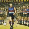
(INSERT GLORIOUS PORTRAIT OF EJ IN TRADITIONAL KIT)
Why do people keep meddling with a classic beautiful guernsey?
Having the stripes around your belly button just looks lame.
Imagine the Carlton crest down on their belly buttons, it would look awful, that's what it's like to me.
****I can never ever ever seem to upload an image on woof. No matter how much I shrink it down to tiny blurry thumbnail, it always tells me it's too big. I was trying to load a picture of EJ in the classic kit. It's also the reason I've never put a picture on my profile. Help anyone????
 Thanks: 14
 Likes: 104
Results 1 to 15 of 182
Thread: Our New Jumper.
-
30-11-2016, 06:37 PM #1
 Coaching Staff
- Join Date
- Oct 2007
- Location
- flemington
- Posts
- 2,886
- Post Thanks / Like

Our New Jumper.
-
30-11-2016, 07:09 PM #2
WOOF Clubhouse Leader
- Join Date
- Jan 2007
- Location
- Wherever the dogs are playing
- Posts
- 61,166
- Post Thanks / Like
Re: Our New Jumper.
The colours have changed dramatically as well over the years. The blue has been all shades, not sure why we can't get it right.
FFC: Established 1883
Premierships: AFL 1954, 2016 VFA - 1898,99,1900, 1908, 1913, 1919-20, 1923-24, VFL: 2014, 2016 . Champions of Victoria 1924. AFLW - 2018.
-
30-11-2016, 07:52 PM #3
Senior Player
- Join Date
- Jun 2010
- Posts
- 1,090
- Post Thanks / Like
Re: Our New Jumper.
I agree too aqua, stripes too low and too thin
-
30-11-2016, 10:32 PM #4
WOOF Member
- Join Date
- Jan 2007
- Location
- Moe's Tavern
- Posts
- 2,880
- Post Thanks / Like
Re: Our New Jumper.
Yeah now that I have seen it i'm not impressed. Also it may just be the young kids being so skinny but they ones they were wearing were very loose, no way you could play with those.
The blue is too light.
The hoops too low and too thin
Perhaps they just rushed in their designs but if you add that ugly grey polo then the results aren't positive for asics.
-
01-12-2016, 09:31 AM #5
Coaching Staff
- Join Date
- Jan 2009
- Location
- Frankston
- Posts
- 4,663
- Post Thanks / Like
Re: Our New Jumper.
DD I agree that the stripes are better higher; they are meant to impress by making the chest seem superhero size.
Too low and it's more like an athletics top.Footscray Football Republic.
-
01-12-2016, 11:11 AM #6
Coaching Staff
- Join Date
- Sep 2009
- Location
- Western Preston
- Posts
- 2,123
- Post Thanks / Like
Re: Our New Jumper.
It's not very flattering having the stripes around the tum area. Should be more of an empire line, right up under the bust!
-
Post Thanks / Like - 0 Thanks, 3 Likes
-
01-12-2016, 11:17 AM #7
Bulldog Team of the Century
- Join Date
- Oct 2007
- Location
- Qld.
- Posts
- 9,669
- Post Thanks / Like
Re: Our New Jumper.
According to the email I received ...which I have also posted in another thread...they say "The Club designs and chooses the colours". Originally Posted by Cyberdoggie

-
01-12-2016, 11:43 AM #8
Bulldog Team of the Century
- Join Date
- Mar 2008
- Location
- Sunshine
- Posts
- 6,268
- Post Thanks / Like
Re: Our New Jumper.
Loved last years - don't like this years' blue.
-
01-12-2016, 12:22 PM #9
Coaching Staff
- Join Date
- Oct 2007
- Location
- flemington
- Posts
- 2,886
- Post Thanks / Like
Re: Our New Jumper.
Is it too late to do anything about it?
-
01-12-2016, 12:29 PM #10
WOOF Member
- Join Date
- May 2008
- Posts
- 3,455
- Post Thanks / Like
Re: Our New Jumper.
It shouldn't be - and I agree with everyone here, it looks weird. Especially seeing the draftees pose in it. Should be a pretty easy fix. Originally Posted by Dancin' Douggy
Is it just me, or were the hoops on our GF strip a bit higher up than our 2016 regular season jumper? May have been the badging altering the look of it - damn we looked good!Float Along - Fill Your Lungs
-
01-12-2016, 03:24 PM #11
WOOF Member
- Join Date
- Mar 2008
- Location
- Ailse 31 Level 2 Row B Seat 59
- Posts
- 1,771
- Post Thanks / Like
-
01-12-2016, 03:30 PM #12
Hall of Fame
- Join Date
- Jun 2008
- Location
- E.J. Whitten Stand
- Posts
- 17,199
- Post Thanks / Like
Re: Our New Jumper.
Not bothered by the colour, but don't like the lower hoops. Should be sitting right under the arm hole.
Our 1954 premiership players are our heroes, and it has to be said that Charlie was their hero.
-
Post Thanks / Like - 0 Thanks, 1 Likes
 bornadog liked this post
-
01-12-2016, 04:52 PM #13
Hall of Fame
- Join Date
- Dec 2006
- Posts
- 10,329
- Post Thanks / Like
Re: Our New Jumper.
Odd decision to place the hoops so low.
-
01-12-2016, 05:19 PM #14
Hall of Fame
- Join Date
- Nov 2008
- Location
- Kyabram
- Posts
- 13,879
- Post Thanks / Like
Re: Our New Jumper.
I don't see the big deal. Looks fine to me.
The curse is dead.
-
Post Thanks / Like - 0 Thanks, 2 Likes
-
01-12-2016, 05:58 PM #15
Hall of Fame
- Join Date
- Mar 2008
- Location
- Dogsville
- Posts
- 12,807
- Post Thanks / Like
Re: Our New Jumper.
Nah they're really low look way better up under the arms. It's a simple thing that has been done incorrectly. Why change it is my question? Originally Posted by chef
But then again, I'm an Internet poster and Bevo is a premiership coach so draw your own conclusions.

 Reply With Quote