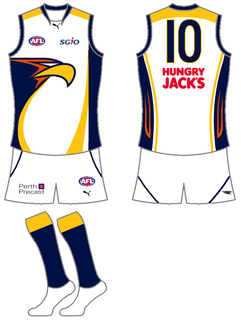
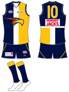
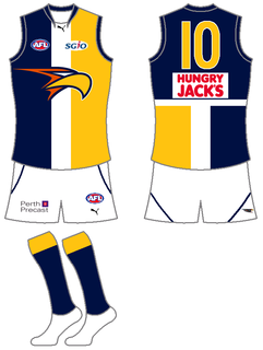
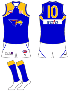
West Coast Eagles
Manufacturer: Puma
Front Sponsor: SGiO/Hungry Jack's/SGiO (Home/Away/Clash)
Back Sponsor: Hungry Jack's/SGiO/Hungry Jack's (Home/Away/Clash)
Shorts Sponsor: Perth Precast
Home 1
Home 2
Away 1
Away 2
Clash
 Thanks: 0
 Likes: 0
Results 16 to 30 of 94
Thread: The Official 2010 Jumper Guide
-
16-01-2010, 06:46 AM #16
 WOOF Member
- Join Date
- Jan 2007
- Posts
- 7,664
- Post Thanks / Like

Re: The Official 2010 Jumper Guide
Last edited by The Coon Dog; 16-05-2010 at 06:45 PM.
85, 92, 97, 98, 08, 09, 10... Break the curse!
-
16-01-2010, 06:48 AM #17
WOOF Member
- Join Date
- Jan 2007
- Posts
- 7,664
- Post Thanks / Like
Re: The Official 2010 Jumper Guide
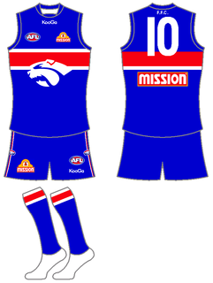
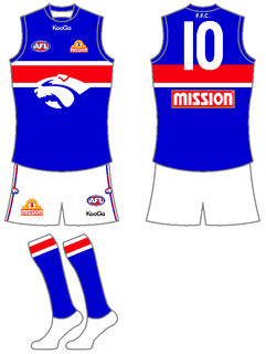
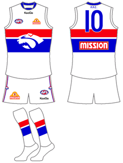
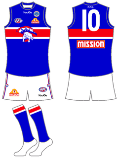
Western Bulldogs
Manufacturer: KooGa (Change from Diadora)
Front Sponsor: Mission
Back Sponsor: Mission
Shorts Sponsor: Mission
Home
Away
Clash
Hall Of Fame
Last edited by The Coon Dog; 29-05-2010 at 08:52 PM.
85, 92, 97, 98, 08, 09, 10... Break the curse!
-
16-01-2010, 12:56 PM #18
Coaching Staff
- Join Date
- Oct 2008
- Location
- Melbourne
- Posts
- 4,130
- Post Thanks / Like
Re: The Official 2010 Jumper Guide
I'd never really thought about it, but it surprised me that Richmond is the only team without a clash jumper. Do they actually not have one, or it just hasn't been announced yet?
Don't like the Brisbane jumper, especially the 'clash' which uses the old Fitzroy colours. Surely they could have left the Fitzroy lion on that at least?
Port are on a winner with their new design.
-
16-01-2010, 02:55 PM #19
Bulldog Team of the Century
- Join Date
- Jun 2008
- Posts
- 6,703
- Post Thanks / Like
Re: The Official 2010 Jumper Guide
The Brisbane jumpers are a disgrace. Originally Posted by jazzadogs

Love the Port design. My favourite designs are the ones that are unique while still remaining simple, which Port have achieved perfectly. IMO if a nan can't knit it, it's no good.
-
16-01-2010, 03:07 PM #20
Draftee
- Join Date
- Jul 2008
- Posts
- 992
- Post Thanks / Like
Re: The Official 2010 Jumper Guide
An excellent criteria. Unfortunately Adidas et al see Nan as competition. (Plus they have a lot of graphic designers on staff who have families to feed) Originally Posted by Rocco Jones
-
16-01-2010, 03:18 PM #21
Bulldog Team of the Century
- Join Date
- Jun 2008
- Posts
- 6,703
- Post Thanks / Like
Re: The Official 2010 Jumper Guide
Good point. Originally Posted by Before I Die
Ironically, the thing is that retro sells at the moment. Our designs are more American than the Americans. NBA teams have gone back to more retro uniforms and the EPL, which would have to the league with most shirts sold worldwide, is full of classic designs.
-
16-01-2010, 04:38 PM #22
Bulldog Team of the Century
- Join Date
- Nov 2008
- Posts
- 5,204
- Post Thanks / Like
Re: The Official 2010 Jumper Guide
The new Port jumper is sensational. Best thing they have ever done. Dislike the club, but love the jumper

-
16-01-2010, 05:12 PM #23
Bulldog Team of the Century
- Join Date
- Jan 2007
- Location
- Behind the goals, Geelong Rd end
- Posts
- 6,465
- Post Thanks / Like
Re: The Official 2010 Jumper Guide
An 8 yo has to be able to draw it. Originally Posted by Rocco Jones
-
16-01-2010, 05:14 PM #24
Bulldog Team of the Century
- Join Date
- Jan 2007
- Location
- Behind the goals, Geelong Rd end
- Posts
- 6,465
- Post Thanks / Like
Re: The Official 2010 Jumper Guide
They don't need one. Originally Posted by jazzadogs
You can tell who the other team are in Richmond games - they're the ones with the ball.
-
16-01-2010, 05:38 PM #25
Draftee
- Join Date
- Jul 2008
- Posts
- 992
- Post Thanks / Like
Re: The Official 2010 Jumper Guide
I believe a team's colours should be sacrosanct, or at least much more so than the design of the jumper. For that reason I don't understand why some teams see a need to introduce new colours into their alternative strips. Surely any clash could be solved by keeping the original colours and simply changing the design and colour emphasis.
-
16-01-2010, 06:57 PM #26
Hall of Fame
- Join Date
- Dec 2006
- Posts
- 10,367
- Post Thanks / Like
Re: The Official 2010 Jumper Guide
Port's is a clear winner. I really don't like a lot of the new jumpers. The Lions and Cats are pretty bad IMO. The rest aren't much better. I wish we'd ditch the Bulldog, as the Power have shown how great a simple jumper can still look.
-
17-01-2010, 02:00 AM #27
Coaching Staff
- Join Date
- Jan 2009
- Posts
- 2,385
- Post Thanks / Like
Re: The Official 2010 Jumper Guide
A few points from me:
-I agree that the Port Jumpers are very impressive. However I did like last years version that had the port logo on the bottom of the V, not above the sponsor.
-Another vote for Brisbane having the worst jumpers.
-I must say that I am very suprised that despite their new logo being hideous, I quite liked the crows away jumper.
-I am suprised that more teams haven't gone for a Home, Away and Clash three jumper system like Melbourne have. Generally speaking, the more jumpers you have the more units get shifted. Perhaps the dogs could appease the fans that hate the white model by producing a jumper that is based around the old school Footscray jumpers?
-
17-01-2010, 02:45 AM #28
Bulldog Team of the Century
- Join Date
- May 2008
- Posts
- 9,056
- Post Thanks / Like
Re: The Official 2010 Jumper Guide
Is that Sydney clash jumper new? Not the worst one going.
Port's jumper is a good one, at long last, but weren't they due?
Brisbane's is an absolute shocker, but still not as bad as Hawthorn and Geelong's clash strips.- I'm a visionary - Only here to confirm my biases -
-
17-01-2010, 10:17 AM #29
Bulldog Team of the Century
- Join Date
- Jan 2007
- Location
- Behind the goals, Geelong Rd end
- Posts
- 6,465
- Post Thanks / Like
Re: The Official 2010 Jumper Guide
It's hardly a clash jumper though Originally Posted by Happy Days
-
17-01-2010, 10:28 AM #30
Hall of Fame
- Join Date
- Apr 2007
- Posts
- 14,664
- Post Thanks / Like
Re: The Official 2010 Jumper Guide
Bar Port who are 'sponsor-less' we are the only club to have the same sponsor on both jumper & shorts.
It would be interesting to see $$ breakdown to see where we are placed and if Mission are shelling out more cash for the privilege of being the sole 'naming' sponsor.


 Reply With Quote