Me too, especially with the white shorts the whole outfit looks ridiculous.Originally Posted by mjp

 Thanks: 0
 Likes: 0
Results 31 to 45 of 58
Thread: Fremantle - New Jumper & Logo
-
02-10-2010, 01:45 PM #31
 WOOF Clubhouse Leader
- Join Date
- Jan 2007
- Location
- Wherever the dogs are playing
- Posts
- 61,264
- Post Thanks / Like

Re: Fremantle - New Jumper & Logo
FFC: Established 1883
Premierships: AFL 1954, 2016 VFA - 1898,99,1900, 1908, 1913, 1919-20, 1923-24, VFL: 2014, 2016 . Champions of Victoria 1924. AFLW - 2018.
-
02-10-2010, 03:49 PM #32
Bulldog Team of the Century
- Join Date
- Jan 2007
- Location
- West of somewhere.
- Posts
- 6,247
- Post Thanks / Like
Re: Fremantle - New Jumper & Logo
There aren't many things we don't agree on SS - our clash jumper and the potential impact of free-agency might just about be the only ones! Originally Posted by Sockeye Salmon
What should I tell her? She's going to ask.
-
03-10-2010, 03:19 AM #33
WOOF Member
- Join Date
- Jan 2007
- Posts
- 8,900
- Post Thanks / Like
Re: Fremantle - New Jumper & Logo
Looks good but what's with these new club jumpers taking leaves from the Victorian state jumper?? Are Port and Freo trying to win friends?
-
03-10-2010, 12:12 PM #34
Bulldog Team of the Century
- Join Date
- Jan 2007
- Location
- West of somewhere.
- Posts
- 6,247
- Post Thanks / Like
Re: Fremantle - New Jumper & Logo
??? Originally Posted by HairyMidget
Are you saying the Victorian state jumper was the cue for this or the first South Freo strip from 1903 or whenever it was - all red with 3 white V's.What should I tell her? She's going to ask.
-
05-10-2010, 01:20 PM #35
WOOF Member
- Join Date
- Jan 2007
- Posts
- 8,900
- Post Thanks / Like
Re: Fremantle - New Jumper & Logo
I actually thought their old strip was fantastic.
And green!
Green is great.
I can't understand why Gold Coast, with a chance to design a jumper from scratch, went with orange/red and yellow.
Looks like a McDonalds advert.
-
05-10-2010, 02:00 PM #36
Draftee
- Join Date
- Sep 2010
- Location
- On a trapeze
- Posts
- 926
- Post Thanks / Like
Re: Fremantle - New Jumper & Logo
Maybe they're looking to pinch Macca's as a sponsor off Collingwood? Originally Posted by Furtanken

-
05-10-2010, 02:04 PM #37
Coaching Staff
- Join Date
- Sep 2009
- Location
- Western Preston
- Posts
- 2,123
- Post Thanks / Like
Re: Fremantle - New Jumper & Logo
I'm a bit sad they've dropped the anchor.
The new jumper reminds me of Bill Oddie's purple trousers in the Goodies.
-
12-10-2010, 10:08 PM #38
WOOF Member
- Join Date
- Jan 2007
- Posts
- 8,900
- Post Thanks / Like
Re: Fremantle - New Jumper & Logo
They should keep as much of the port and ocean - related references as possible. The anchor, the wharfie bloke who raises the anchor, the heave-ho. It locates them and gives them authenticity. Our club could do with incorporating some local references of its own (no that does not mean going back to the FFC name).
-
13-10-2010, 12:18 AM #39
Bulldog Team of the Century
- Join Date
- Jan 2007
- Location
- Behind the goals, Geelong Rd end
- Posts
- 6,465
- Post Thanks / Like
Re: Fremantle - New Jumper & Logo
Vietnamese restaurant? Originally Posted by Alan Shorty
(It was too easy to say drugs and dole cheques, like sheep jokes for Kiwis).
-
13-10-2010, 01:49 PM #40
Bulldog Team of the Century
- Join Date
- Jul 2008
- Location
- Surf Coast
- Posts
- 5,466
- Post Thanks / Like
Re: Fremantle - New Jumper & Logo
Forges, Barkly or Poon's. Originally Posted by Sockeye Salmon
It's better to die on our feet than live on our knees.
-
13-10-2010, 02:14 PM #41
WOOF Member
- Join Date
- Jan 2007
- Posts
- 8,900
- Post Thanks / Like
Re: Fremantle - New Jumper & Logo
Highpoint, Vic Uni, bad KFC, Scumshine.
Although, does 'Western' cover nouveau riche areas like Altona, Willy, Seddon etc.? Heck, could we claim the Docklands?
-
13-10-2010, 03:48 PM #42
Hall of Fame
- Join Date
- Dec 2006
- Location
- Mulligan's Boogie-board
- Posts
- 13,786
- Post Thanks / Like
Re: Fremantle - New Jumper & Logo
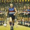
The new Freo jumper isn't bad, it looks like and older style Rugby League jumper to me, sans sleaves & collar.
Western Bulldogs: 2016 Premiers
-
13-10-2010, 07:18 PM #43
Bulldog Team of the Century
- Join Date
- Jul 2008
- Location
- Surf Coast
- Posts
- 5,466
- Post Thanks / Like
Re: Fremantle - New Jumper & Logo
Weribee surage plant, Time ball tower or the Westgate. Originally Posted by Lantern
It's better to die on our feet than live on our knees.
-
13-10-2010, 10:32 PM #44
Bulldog Team of the Century
- Join Date
- Jan 2007
- Location
- Behind the goals, Geelong Rd end
- Posts
- 6,465
- Post Thanks / Like
Re: Fremantle - New Jumper & Logo
You feeling a bit homesick? Originally Posted by KT31
-
14-10-2010, 12:56 PM #45
WOOF Member
- Join Date
- Jan 2007
- Posts
- 8,900
- Post Thanks / Like
Re: Fremantle - New Jumper & Logo
Hoon drivers, concrete lawns, McMansions, panel vans, the Maribyrnong explosives factory, tramless streets. Originally Posted by KT31
ps. Got to love the smell driving home past Werribee. That's when you REALLY know you're not in Lorne anymore.

 Reply With Quote