Like I said, no problem with any of that.Originally Posted by GVGjr

I can't think of many places to get better feedback than from dedicated fans on a site like this.
 Thanks: 0
 Likes: 0
Results 91 to 105 of 121
Thread: Had a go at a new Bulldogs logo
-
21-05-2011, 10:04 PM #91
 Bulldog Team of the Century
- Join Date
- Aug 2009
- Location
- East of the West
- Posts
- 9,252
- Post Thanks / Like

Re: Had a go at a new Bulldogs logo
-
22-05-2011, 04:33 PM #92
Coaching Staff
- Join Date
- Apr 2008
- Location
- Sunshine
- Posts
- 3,839
- Post Thanks / Like
Re: Had a go at a new Bulldogs logo
I'd drop the banner and make the 2nd logo smaller. Looks a bit too big to my eyes there. Alternatively I'd be thinking of mucking around with an FFC monogram or something similar.
-
23-05-2011, 12:54 AM #93
Coaching Staff
- Join Date
- Nov 2007
- Location
- Sydney
- Posts
- 4,846
- Post Thanks / Like
Re: Had a go at a new Bulldogs logo
This. Two big, strong stripes look fantastic. Originally Posted by AndrewP6
I should leave it alone but you're not right
-
24-05-2011, 12:44 AM #94
WOOF Member
- Join Date
- Jan 2007
- Posts
- 8,900
- Post Thanks / Like
Re: Had a go at a new Bulldogs logo
Take it off, it stood for nothing against WC Originally Posted by AndrewP6
-
24-05-2011, 10:44 AM #95
WOOF Clubhouse Leader
- Join Date
- Jan 2007
- Location
- Wherever the dogs are playing
- Posts
- 61,463
- Post Thanks / Like
Re: Had a go at a new Bulldogs logo
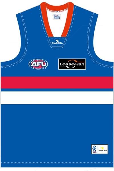
Costa, that jumper is going back to the 70's. Personally I prefer the pre 70's jumper with the broken lines, but thicker than what we use to have.
Here is the 50's style
 FFC: Established 1883
Premierships: AFL 1954, 2016 VFA - 1898,99,1900, 1908, 1913, 1919-20, 1923-24, VFL: 2014, 2016 . Champions of Victoria 1924. AFLW - 2018.
-
24-05-2011, 10:50 AM #96
WOOF Clubhouse Leader
- Join Date
- Jan 2007
- Location
- Wherever the dogs are playing
- Posts
- 61,463
- Post Thanks / Like
Re: Had a go at a new Bulldogs logo
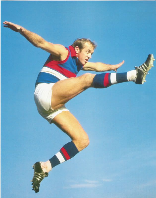
Costa, here is Teddy wearing it. If we can improve on this, likke wider stripes I think it would look great.
 FFC: Established 1883
Premierships: AFL 1954, 2016 VFA - 1898,99,1900, 1908, 1913, 1919-20, 1923-24, VFL: 2014, 2016 . Champions of Victoria 1924. AFLW - 2018.
-
24-05-2011, 10:57 AM #97
WOOF Member
- Join Date
- May 2008
- Posts
- 3,460
- Post Thanks / Like
Re: Had a go at a new Bulldogs logo
^^
I've got both heritage jumpers (as in the thick stripes we wore in 04 and 05 - I've got the one vs Richmond in 05 when Boyd kicked 'that' goal at the end of the 3rd quarter) and the one we wore against Carlton a few years ago with the thinner stripes, and I honestly prefer the way the thinner striped version looks.
Having said all that, the jumper Costa is proposing is a massive improvement on our current gear, and I'd take it in a heartbeat.
Is it just my screen, or does the red look a little pink? I swear the Melbourne red this year is really pink, which I'd hate if I was a Dees fanFloat Along - Fill Your Lungs
-
24-05-2011, 01:27 PM #98Kelso @ Mt Eliza Guest
Re: Had a go at a new Bulldogs logo
[QUOTE=bornadog;216672]Costa, here is Teddy wearing it. If we can improve on this, likke wider stripes I think it would look great.
with you bornadog - love the older design....
I was at the Ted Whitten bar at the Telstra Dome during the Richmond Game and was admiring the old Whitten jumper behind the display glass. I was wearing an 80's jumper.. my nephew was wearing the new robodog jumper.. we all took a vote and the 50's version won hands down..
In saying that though.. i do like the revamped one costa has done here too.
Well done again Costa - you have achieved something that is really special here - hope it get's off the ground. either design is a great improvement on our current robodog...
-
24-05-2011, 05:37 PM #99
Hall of Fame
- Join Date
- Apr 2010
- Location
- The Kennel
- Posts
- 15,747
- Post Thanks / Like
Re: Had a go at a new Bulldogs logo
Wild idea i know, but i like this one.

-
24-05-2011, 05:44 PM #100
WOOF Member
- Join Date
- Jan 2007
- Posts
- 8,900
- Post Thanks / Like
Re: Had a go at a new Bulldogs logo
Me too ! Originally Posted by Grantysghost
-
24-05-2011, 10:04 PM #101Costa Guest
Re: Had a go at a new Bulldogs logo
Thanks everyone for the feedback on the jumper. I think you've got very strong traditional strips that would look great on the field today. Personally, I'm not sure the jumper needs a logo at all, but I thought I'd mock something up in response to a request by a forum member.
Thought you'd be interested to hear I received a letter today from Simon Garlick in response to the submission I sent the club a week ago.
First up, I was really impressed that Simon took the time to write up such a detailed and personalised reply and that he got it back to me so quickly. The guy must have a lot on his plate and his response was a heck of a lot more than the 'thanks but no thanks' pro forma spiel I was expecting. Class act.
Simon talked about how repositioning the Bulldogs brand was an "absolute key focus area of [the club's] 2011 - 2015 Business Plan". He also emphasised that the club plans to involve the membership in the ongoing process 'to make the most informed strategic decision possible.'
Sound like they're going to go about this the right way and not spring something on you out of the blue Brisbane-style.
Basically Simon acknowledged that the current branding needs to change and it's going to be a long term inclusive process. They've taken some notice of what I sent through and they're going to throw it into the mix during their planning sessions.
EasternWest asked whether I supported the Doggies. Fair question. No I do not. I just strongly feel that the current Bulldogs logo doesn't quite nail the club's spirit and tradition.
For what it's worth this is the first time I've reached out to to a club's online forum for help in developing a new logo. I learnd a lot. Everyone's comments have been extremely constructive and intelligent. I think that the final artwork came out much, much stronger that the first draft I lobbed here because of your thoughtful suggestions. Thank you for having me on board, and big thanks to GVGjr for giving me the green light.
-
24-05-2011, 10:30 PM #102
Bulldog Team of the Century
- Join Date
- Aug 2009
- Location
- East of the West
- Posts
- 9,252
- Post Thanks / Like
Re: Had a go at a new Bulldogs logo
Good on you Costa. You put a lot into the jumper, and I'm sorry it didn't work out for you. Thanks for your honesty, and good luck in future!
(sounds pro-forma, but I mean it )
)
-
24-05-2011, 10:42 PM #103Costa Guest
Re: Had a go at a new Bulldogs logo
Cheers EasternWest
Thanks for the kind words!
Wasn't expecting the Club to jump on board and change their logo on the basis of a proposal that dropped on them from out of nowhere... that wouldn't be realistic or prudent on their behalf. But then again, Simon's letter didn't exactly close the book on the new design. He spoke positively about the general submission and raised the possibility of having a chat down the track, so who knows?
The good news is that a) the Club recognises a lot of what you guys have been saying about your logo and broader image, and b) they're going to do something about it in a way that's open and honest. I'm sure a lot of people will be involved in shaping the final logo design, so keep an eye out for how you can get directly involved with your ideas.
(Just in case anyone hasn't seen what I sent through)
Last edited by Costa; 24-05-2011 at 11:35 PM.
-
24-05-2011, 10:55 PM #104
WOOF Member
- Join Date
- Jan 2007
- Posts
- 8,900
- Post Thanks / Like
Re: Had a go at a new Bulldogs logo
I've always thought it would be great on the back of the jumper underneath the number to have
.....................11.................
..............SONS OF THE WEST............................
.
-
18-07-2012, 10:44 PM #105
Coaching Staff
- Join Date
- Apr 2008
- Location
- Sunshine
- Posts
- 3,839
- Post Thanks / Like
Re: Had a go at a new Bulldogs logo
Saw this onbigfooty, poster claims it is on the ATMOSS site. Would expect this is something that pops up soon enough if that is the case:

 Reply With Quote